I like the ability to see examples in the reference area of Codea but when a great deal of the keywords are dark gray on a black background reading the examples is next to impossible. Is there a setting I am not seeing? I mean it’s no too useful if it can’t be seen.
@Scotty - what do you mean by reference area ? You can see the code for examples by loading them from the project list page after opening the Examples folder there and loading the example you are interested in. The code you get is in the same format that you see when you load/edit your own project. You can modify the appearance from the settings window after tapping the settings icon in top right of the main projects listing window.
@Bri_G Thanks for your reply.
I see what you are referring to when it comes to changing the appearance of the editor, and that is all very interesting, but what I am referring to something else.
If I press the “eyeball” button from the editor’s keyboard it takes me to what I refer to as the “Reference” area. That is where “Graphics”, “Craft”, “Shaders & Mesh” etc are listed and documented.
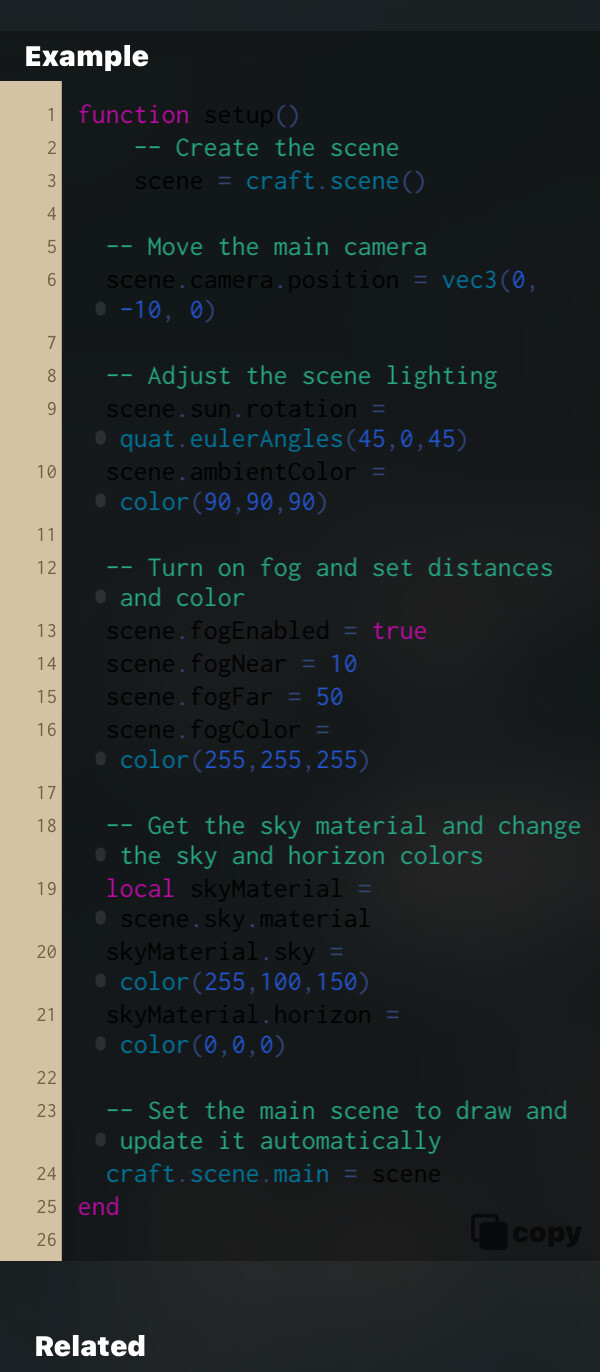
If you select “Craft”, then select craft.scene for instance, then scroll down towards the bottom of the column, right before “Related”, you should see “Example”. This is what I am referring to.
The example shown has keywords (reserved words perhaps) that are dark gray on the black background. This is one of many examples that display in this manner.
I hope you see what I’m getting at. Maybe it’s my 66-year-old eyes but I find it hard to read.
Thanks, again.
@Scotty- Aaaah, I see what you mean, copied the image you referred to and attached. When viewed from the photos app this is quite readable but I struggle to see the code sometimes ( my eyes are older than yours !!! ).
In the short term capturing an image could work but I think longer term this needs addressing.
@Sim @jfperusse - a few suggestions -
- Increase the font size, show against white background, or
- Place a link icon where the image is and open a temporary window superimposed over the main editing window which is either scalable by dragging or adjustable for size, colours, text, background and font and collapsible.
- A neat feature would be to copy and paste the code to transfer to a new project tab.
@Bri_G thanks for the reply. I look forward to updates that would make this easier to read. In the meantime I also copied the example into a new Codea project and it was nicely formatted. Thanks for that tip. However, I knew the copy button was in the lower right corner, and that’s the only way I knew to do that. Otherwise it’s impossible to see.
Thanks for looking into this issue and I look forward to any updates.
@Scotty - thanks for the reply, I’d forgotten about the double arrow in the bottom corner, it’s actually there on the image I have posted. But I have tried numerous times on my iPad since and I can not see the double arrow in the bottom left corner.
@Sim @jfperusse Looking carefully at the example code, in the bottom left after scrolling, in the bottom right corner of it I don’t see the double arrow. But, in that position, there is a suggestion of a slightly darker area which, when pressed, does capture the code which is paste-able.
If that issue is corrected then the example is useable but I still think the format display of the example is poor and almost unreadable.
Sorry both, this is a bug that we will be addressing in the next version
1 Like
Thank you. I look forward to the update.